Halftones for screen printing: angle, frequency, dot shape.
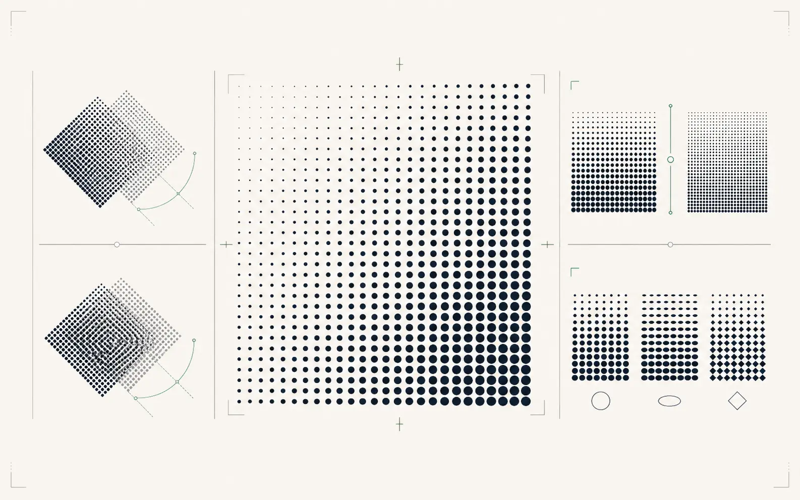
A halftone screen converts continuous-tone gradients into a pattern of dots that the press can actually print. Three variables matter: angle, frequency (lpi), and dot shape. Get any of them wrong and you get moiré — those rippling interference patterns that ruin the print.

Angle
The angle of the dot grid relative to the print direction. Standard angles: K = 45°, C = 15°, M = 75°, Y = 0°. The 30° separation between channels minimizes moiré because their dot patterns do not align. Get two channels within 15° of each other and the patterns lock up into visible interference.
Frequency (lpi)
Lines-per-inch of the halftone grid. Higher lpi = finer detail = also finer dots that the press needs to hold. 110 mesh: 45-65 lpi. 156 mesh: 65-85 lpi. 196 mesh: 85-110 lpi. Push lpi too high for your mesh and the small dots gain on press, blowing out shadows. Push too low and you can see the dots from across the room.
Dot shape
Round dots are the workhorse — predictable gain, easy to hold across mid-tones. Elliptical dots reduce visible patterning in skin tones (great for portraits). Diamond dots are sharper in highlights but harder to print. Most apparel jobs use round; T-shirt photo prints often use elliptical.
Mesh-to-lpi rule of thumb
Frequency should be roughly 2.5× your mesh count. 110 mesh → 45 lpi. 156 mesh → 65 lpi. 230 mesh → 95 lpi. Below the ratio: visible dots. Above the ratio: dot gain on press.
Underbase halftones
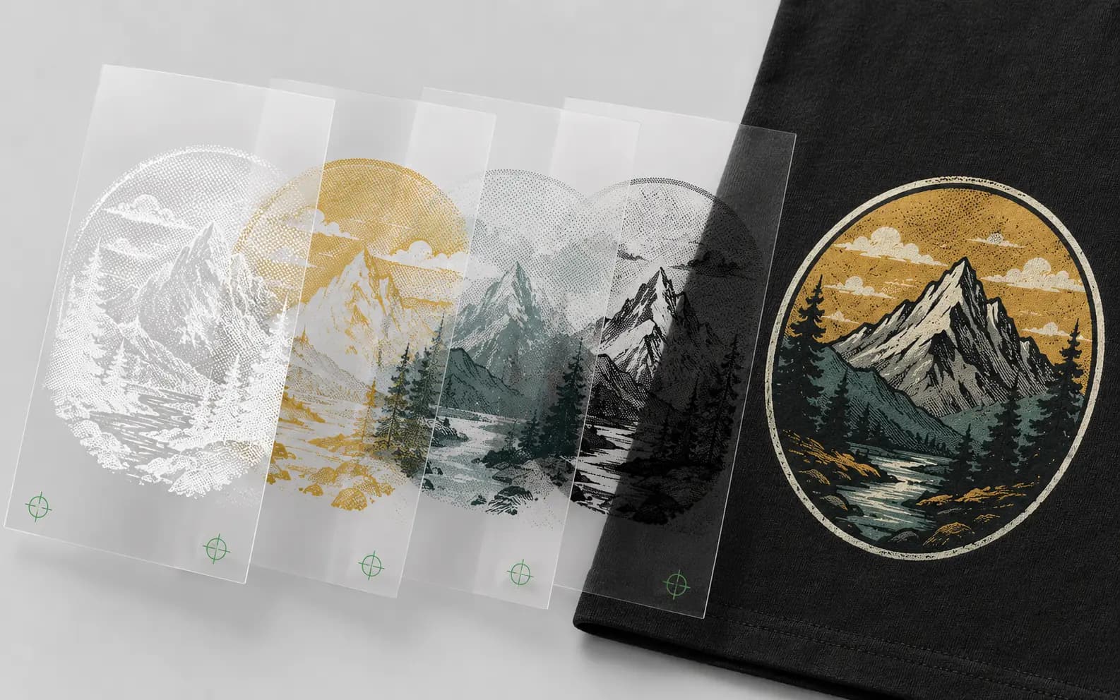
On dark garments with a white underbase, the underbase needs its own halftone — usually 5-10 lpi lower than the top colors, to prevent the underbase dots aligning with color dots and showing through. We default to a 50% underbase choke and 55 lpi for 110-mesh whites.
Skip the halftone guesswork. A human sets your seps up right.
Angle, frequency, dot shape, underbase — dialed for your mesh and press. Production-correct color separations in 24 hours.
Need something custom? Email hello@vectorwiz.com
What we deliver
Pre-built halftone separations in AI and PDF — one layer per ink, with halftone angle and frequency labeled on each layer for your RIP. No guessing, no re-screening on press. See screen printing →
Frequently asked questions
What are halftones in screen printing?
Patterns of dots that simulate a continuous tone using a single ink. Because a screen lays down solid ink, gradients and shading are reproduced by varying dot size and spacing so the eye blends them into a tone.
Does the artwork itself need to contain halftone dots?
Usually not. You supply clean vector separations and the halftone dots are generated at output by the RIP or imaging workflow, at the line count and angle the shop specifies for its mesh. Baking dots into the art too early removes the shop's control.
What line count and angle should be used?
That is the printer's call — it depends on mesh count, ink, press, and substrate. Ask the shop running the job for its preferred values rather than guessing, because a halftone that is too fine for the mesh fills in or drops out on press.
What do you deliver for a multi-color screen job?
Clean vector separations with each spot color on its own named layer, type outlined, and traps or chokes where the shop needs them. That gives the screen room a file it can output directly rather than rebuilding.
Spot color or simulated process?
Spot color or simulated process? Spot separations suit solid, brand-critical color and a limited palette; simulated process suits photographic or heavily blended art. The choice belongs to the shop and the design — we build the separations to whichever route you are printing.
Naimur Rahman
Leads design direction and quality at VectorWiz. Reviews and redraws production artwork by hand across sign, screen-print, embroidery, and CNC work.
Related articles
Drawn by hand. Built for production.
Instant pricing, no commitment. Production-correct vectors in your inbox in 24.