Why vector files matter for sign shops — and how to spot a bad one.
The difference between a vector file that prints and one that fails on the router isn't usually obvious until you're standing at the machine, watching the cut go wrong. Here's what we look for before any file ships, and what you should look for before you cut.

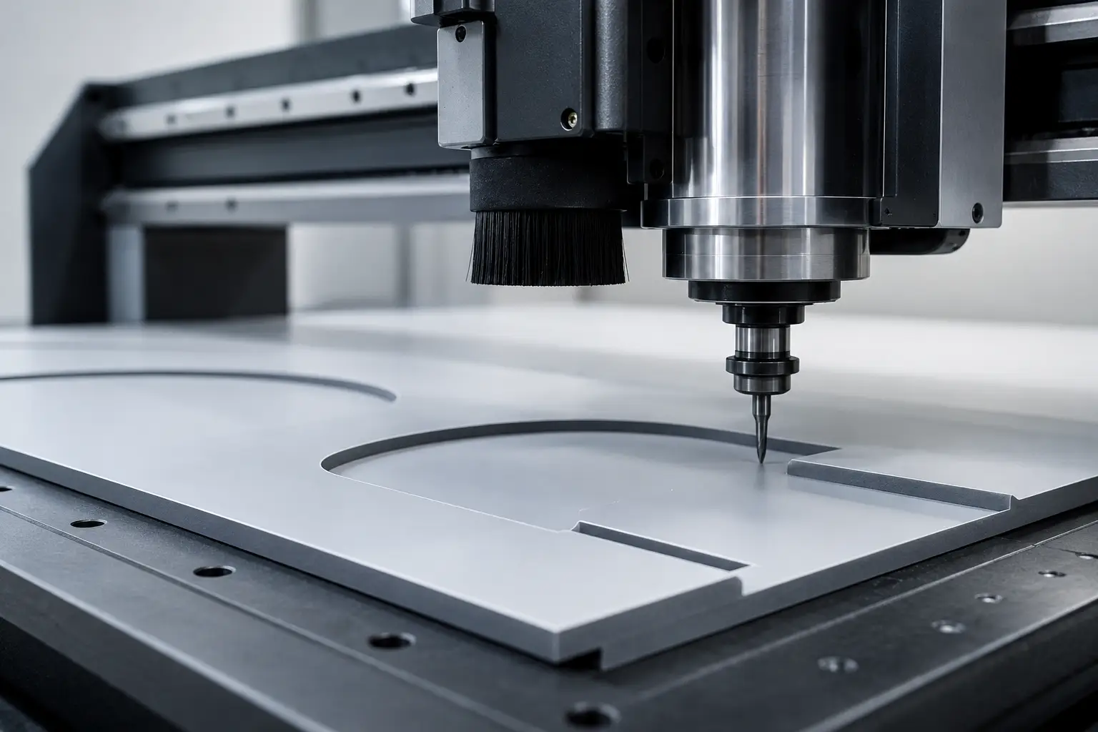
If you've been running a sign shop for more than a few weeks, you already know vector files matter. What you might not know is how many ways a vector file can be technically correct and still completely useless to you.
Customer sent a garbage logo? Send it to us — plotter-ready in 24 hours.
We redraw it clean: closed paths, cut-ready contours, named spot colors — the file your plotter, router, and printer actually like. Your shop keeps the margin.
Need something custom? Email hello@vectorwiz.com
It's a file. It opens in Illustrator. It looks like the logo. So why does the router carve a wavy edge where a straight line should be? Why does the channel letter have a flat side that shouldn't be flat? Why is the file three megabytes when it should be twenty kilobytes?
The answer, almost every time, is that the file you got back from a budget vector service is auto-traced — algorithmically generated from a raster image without anyone looking at it. The algorithm doesn't know what a channel letter is. It doesn't know your tooling. It doesn't care.
What auto-trace gets wrong, specifically.
Auto-trace algorithms work by following the boundary between colors in a raster image, pixel by pixel, and approximating that boundary with vector curves. That sounds reasonable until you think about what your source image actually looks like at the pixel level.
A 300dpi scan of a 4-inch logo has 1,200 pixels along each edge. The edge of a letter "O" is not a smooth curve in that scan — it's a staircase of pixels with anti-aliasing fuzz. The algorithm dutifully traces every bump. You get back a file with 200+ anchor points on a single letter when the original needed eight.
What does that mean at the router?
- Tool path becomes ragged. The CAM software interprets each anchor as a direction change. 200 anchors = 200 micro-direction-changes per letter = a visibly wavy cut edge.
- Cut time triples or worse. Every direction change is a moment where the spindle slows down. A clean four-anchor curve cuts in seconds. A 200-anchor mess takes minutes.
- File size explodes. The DXF for that same logo goes from 18KB to 2.4MB. Your operator's CAM software stutters opening it.
- Detail collapses. Where the trace algorithm got confused — usually at corners and intersections — you get rounded-over corners that should be sharp, and sharp jags where corners should be smooth.
How to spot it in 30 seconds
Open the file in Illustrator (or Inkscape). Press A to switch to the direct selection tool. Click on any closed shape. Now look at the anchor count.
A good hand-drawn vector logo for a sign shop has anywhere from 4 to 60 anchor points for most letterforms and simple shapes. A "C" might have 6. A complex script "g" might have 30. An entire wordmark might have 200 total across all letters.
A bad auto-traced file has 200+ anchor points on a single letter, and 2,000+ across a wordmark. If you see numbers in the thousands when you should see numbers in the dozens, you've got an auto-trace job.
What a hand-drawn file looks like.
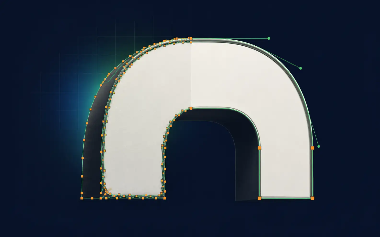
A senior designer who knows what they're doing draws each letterform from scratch. They start with the basic geometric shape — a circle for an O, two stems for a U — and add curves only where the typeface requires them. They use the fewest anchor points possible while preserving the letterform.
The result is a file that's small (often under 20KB even for complex logos), cuts cleanly, and renders identically at any size. The corners are exactly where they should be. The curves are smooth from the geometry, not from filtering. The file makes sense if you select all and look at the anchor structure.
You can tell a hand-drawn file by what's not in it. No stray anchors. No tiny path segments. No micro-direction-changes in what should be a clean curve. It's almost boring to look at — and that's the point.
The five-point sign-shop checklist
Before you cut, run a vector file through this:
- Anchor count check. Select all paths. Look at the number. If a wordmark has more than 300 total anchors, send it back.
- Closed-path check. In Illustrator, Object → Path → Clean Up. If "remove stray points" finds anything, the file wasn't validated.
- Layer naming. Layers should be named for what they are — "VINYL · PMS 354 C" or "ROUTE · 1/8 DOWN-CUT" — not "Layer 1 copy 3."
- Scale check. File should be drawn at install dimensions. Not arbitrary; not "scalable to anything." If your target is 36 inches wide, the file should be 36 inches wide.
- Kerf compensation note. If you're routing, kerf compensation should already be applied. Ask. If they don't know what kerf is, that tells you something.
What this costs (or saves) you.
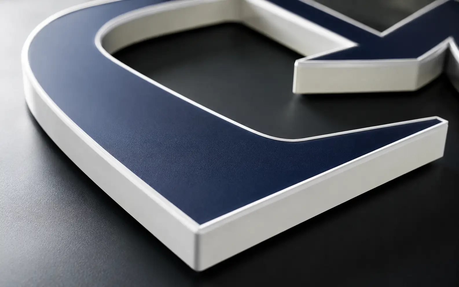
The math is simple. A bad vector file costs you 30 minutes of router fix-time on a routine job, and an hour on a complex one. Multiply by how many jobs you do a week. Multiply by your shop rate.
A senior designer takes 30 minutes to draw a Tier 2 wordmark from scratch. We charge $57 for it. If you're spending more than 30 minutes a week cleaning up vector files for cutting, paying somebody who knows what they're doing to deliver clean files in the first place is a margin-positive trade every time.
And that's before we get to the worst-case outcome — the case where you don't catch the bad file before you cut, and you carve a $400 piece of aluminum into a wavy mess. That's where the real cost lives.
Frequently asked questions
What vector format should I send to my vinyl plotter or sign software?
EPS or AI with every cut path closed is the safest input — Flexi, SignLab, and most plotter software (Roland, Graphtec, Summa) are built around them and carry CMYK and spot colors. Many shops also take vector PDF, SVG, or DXF. Outline the fonts in your delivery copy so the shop does not need your typefaces installed.
How can I tell a vector file will fail on the router before I cut?
Look for open paths, floating or duplicate nodes, un-outlined fonts, and RGB colors where spot colors should be. Auto-traced files are the usual culprit — lumpy curves and stray points that the plotter or router chokes on. Clean production vector has closed paths, named color layers, and outlined type.
Do fonts need to be outlined on sign files?
Yes, in the file you send to production. If the shop does not have your exact typeface, live text substitutes and the layout shifts. Converting type to outlines locks the lettering as paths. Keep a separate master with editable text in case the wording changes later.
What format do CNC-routed or laser-cut signs need?
DXF with closed paths, in the version and units the CAM software expects, with kerf compensation baked in so the cut part matches the art. Cut, score, and engrave belong on separate named layers. See the DXF kerf compensation guide for the offset details.
My customer only sent a JPEG — can you make it sign-ready?
Usually yes. A raster JPEG is not production-ready, so we rebuild it as clean vector by hand, matching the original, with closed paths and named color layers ready for your plotter or router. How well it goes depends on the JPEG — upload it and we give an honest read first.
Naimur Rahman
Leads design direction and quality at VectorWiz. Reviews and redraws production artwork by hand across sign, screen-print, embroidery, and CNC work.
Related articles
Send us your worst. We'll send it back clean.
Instant pricing, no commitment. Drawn by hand in 24.