After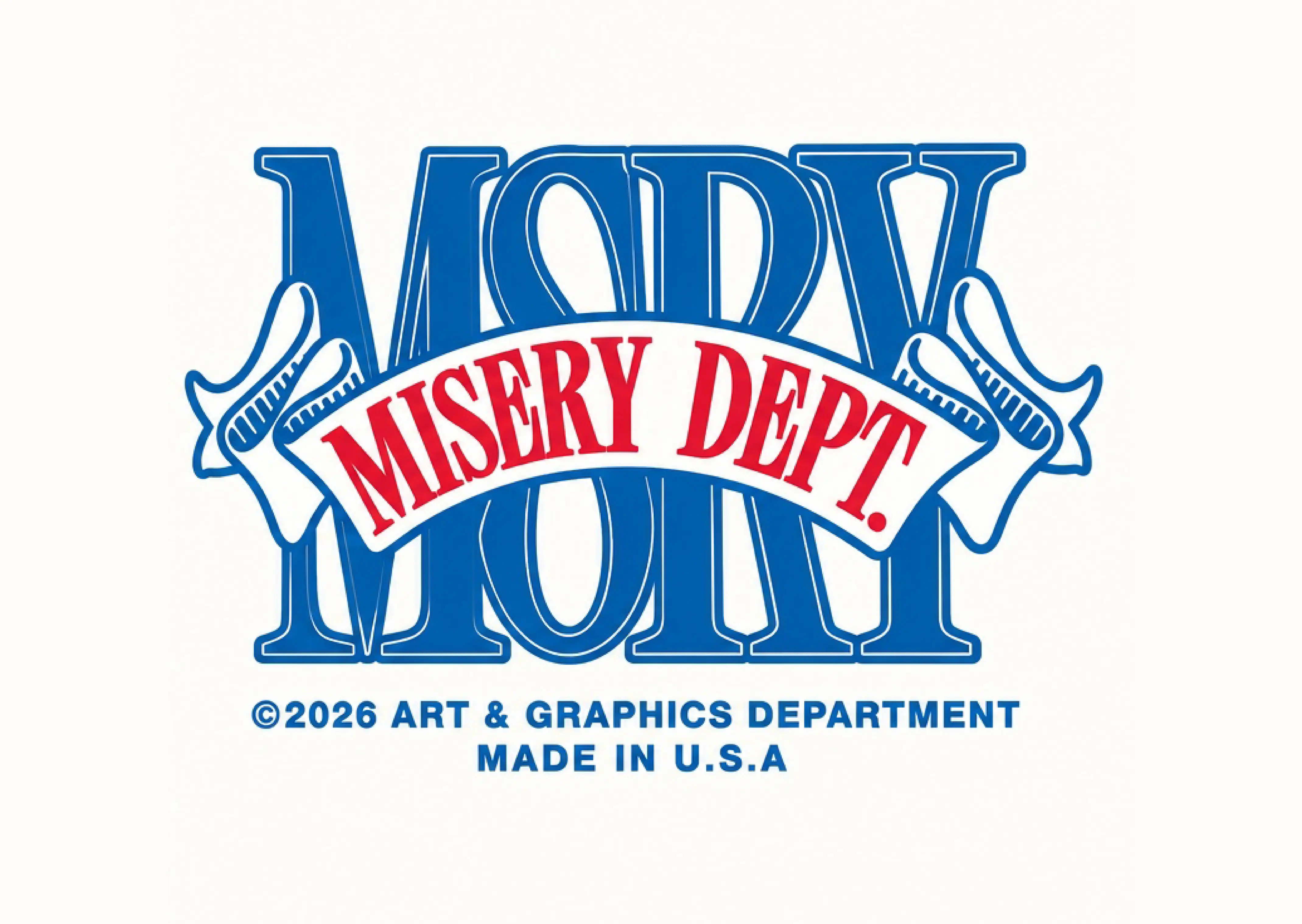
Before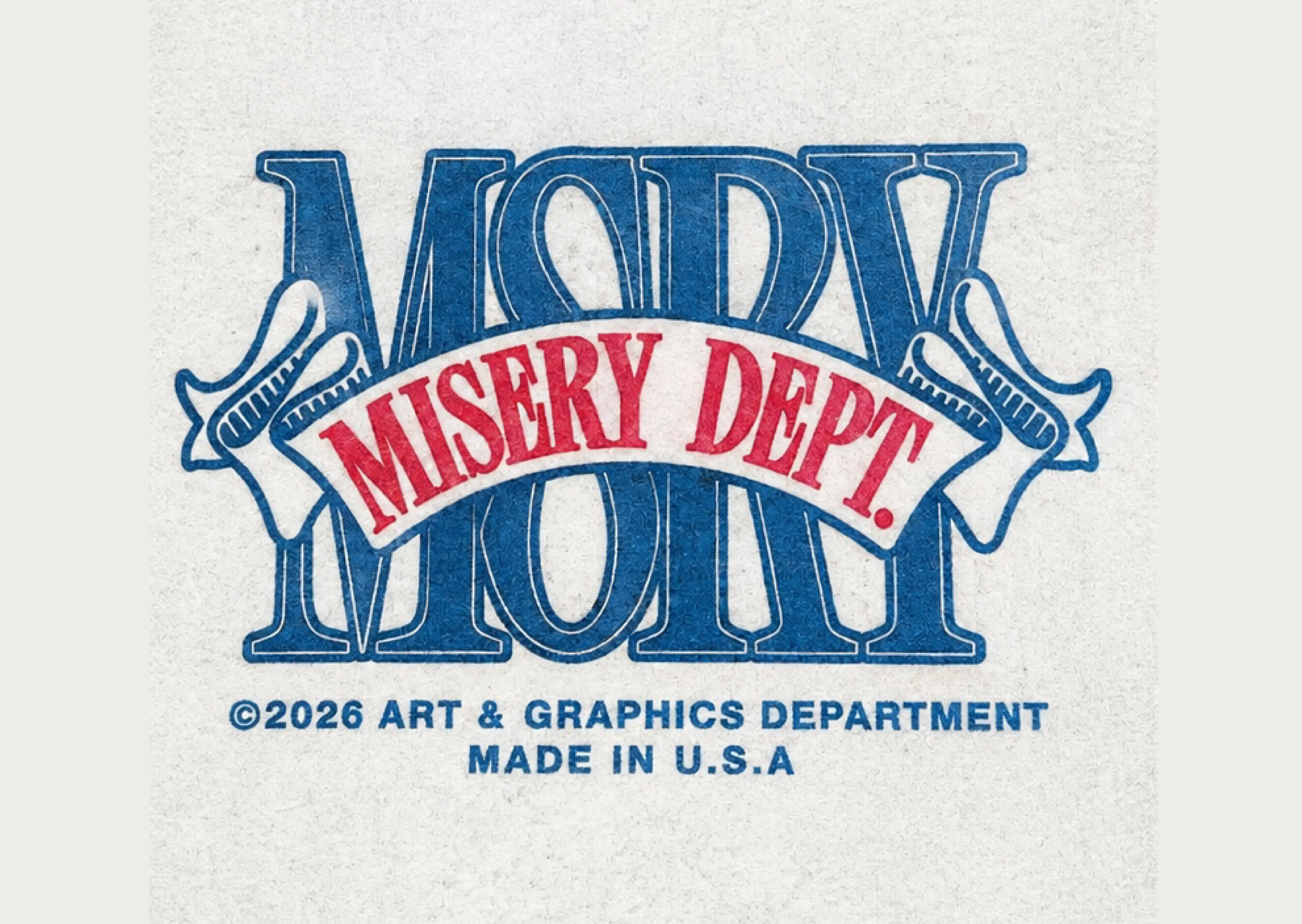
A stacked wordmark with a ribbon through the middle, rebuilt so the overlaps stay intentional.
Drag to compare before and after
Misery Dept. is a blue interlocking wordmark with a red MISERY DEPT. banner and a small credit line under it, redrawn as vector art for screen printing. This page is that piece, not a format guide.
Large blue letters lock into each other. A red banner cuts across the middle with MISERY DEPT. White ribbon tails stick out at the sides. Underneath, a small line reads the art and graphics credit and MADE IN U.S.A. The overlaps are the whole trick: if they fill wrong, the letters turn into one blob.
The letters and banner were redrawn as separate closed shapes so a printer can hold the blue and the red apart. The small credit line was redrawn with them, not left as a blurry raster. Apparel shops comparing marks like this can start at VectorWiz's letter desk.
No. The blue lettering and the red banner were redrawn as separate closed regions so the colors can be held apart on press.
Hand-drawn vector art in AI, SVG, EPS, and PDF, with the type outlined for garment printing.
Yes. The line under the mark was redrawn with the letters. It is part of the artwork, not a caption we added.
A designer redraws the overlaps as closed vector shapes. The quote shows when you upload.