What is a vector file? Vector graphics explained The format every logo, icon, and production-ready cut path lives in.
A vector file stores an image as mathematical paths — points, curves, and fills — rather than a grid of pixels. The math means they scale infinitely without losing quality, store in tiny files (a logo can be 5 KB instead of 5 MB), and produce the closed, clean geometry that vinyl plotters, embroidery digitizers, CNC routers, and screen-print presses all need. Common formats: SVG (web), AI (Illustrator source), EPS (legacy print), PDF (vector inside), DXF (CNC).

What are vector graphics?
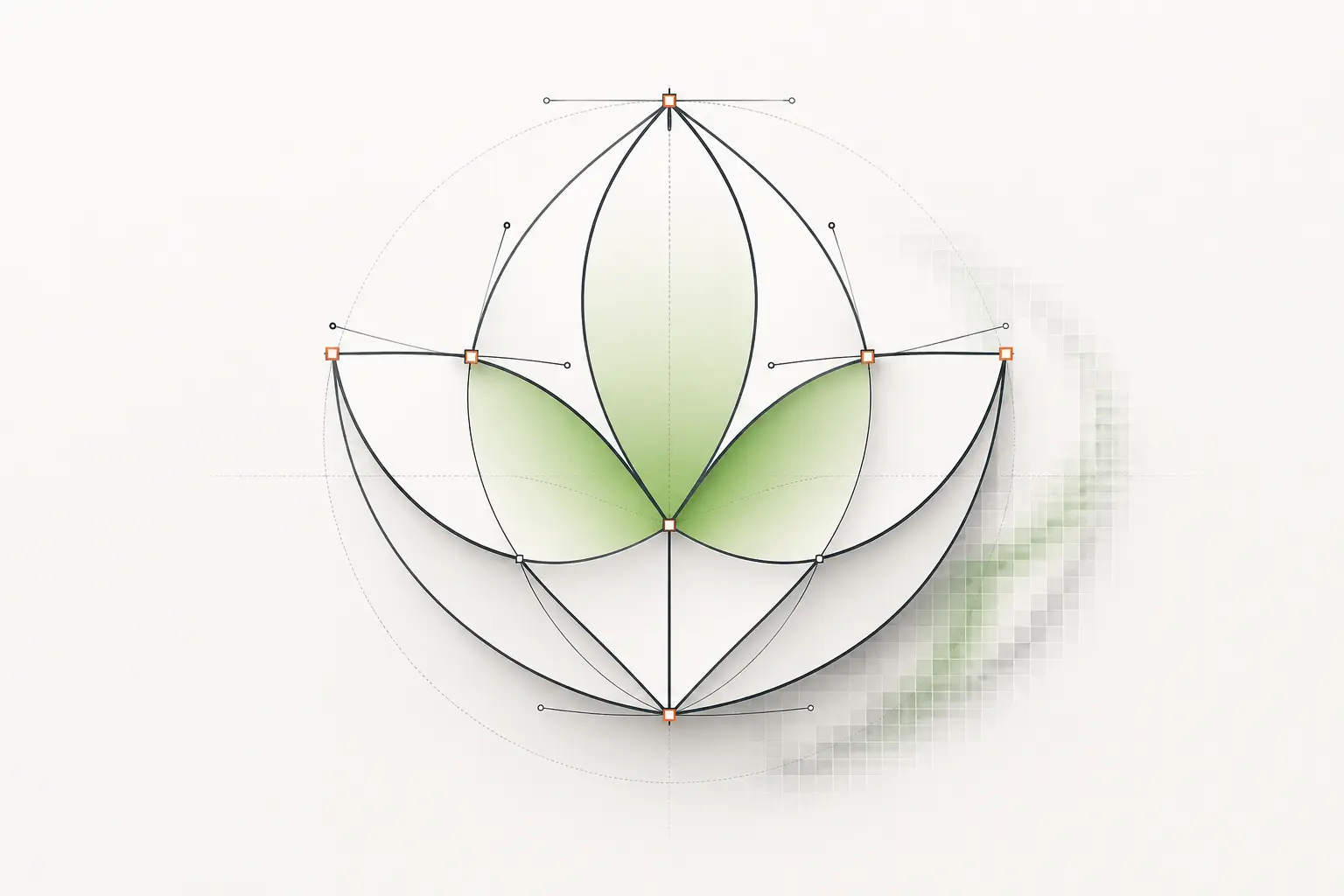
Vector graphics are images stored as instructions for how to draw them, not as the drawing itself. A vector logo is a list of points, curve shapes, and fills — together they tell any compatible renderer (your browser, a vinyl plotter, a CNC router) how to reproduce the artwork at any output size.
The opposite is raster graphics, which store the image as a grid of pixels (small coloured squares). Both formats are essential in modern design — they’re tools for different jobs, not alternatives. Photographs are always raster; logos and production-output artwork are almost always vector.
One catch: the file extension does not prove the artwork is vector. A JPG placed inside a PDF or an EPS is still pixels inside a vector container. For a side-by-side comparison, see our pixel vs vector guide.
Is PNG, JPG, PDF, EPS or SVG a vector file?
| File type | Vector? | What to check |
|---|---|---|
| PNG | No, always raster | Transparency does not make it vector. It is still a grid of pixels and needs redrawing for production. |
| JPG / JPEG | No, always raster | Same as PNG, plus compression blur around edges and text. |
| SVG | Yes, by definition | An SVG can still wrap a placed photo or screenshot. Make sure the artwork itself is paths. |
| AI | Yes (Illustrator source) | Usually vector, but it can contain embedded images. Check that the logo is not a placed bitmap. |
| EPS | Usually | Older software often saved a raster preview or a placed image inside an EPS. Open it and select the shapes. |
| Sometimes | Vector when exported from Illustrator or a layout program; raster when scanned or saved from a photo or screenshot. | |
| DXF | Yes (CAD and CNC) | Vector, but paths must be closed and joined before a router or laser can cut them. |
The quick test: open the file in Illustrator or Inkscape and click a single shape. If you can select it as a path, the file is vector. If the whole image selects as one box and zooming in shows squares, it is raster, and it needs a raster to vector conversion before a cutter, press or engraver can use it.
How vector graphics work, briefly
Every vector image is built from a small set of primitives: anchor points, straight or curved segments connecting them (Bézier curves, named after Pierre Bézier who published the math at Renault in 1962), fills (solid colours or gradients), and strokes (outline weights). A logo is typically 10–100 anchor points; a complex illustration might be 1,000–10,000.
When a vector file renders, the software walks the path list and draws each shape at the requested output resolution. The same file rendered at 100 px and 10,000 px produces sharp output at both — the math is recomputed at each size.
Common vector file formats
| Format | Best for | Who accepts it | Notes |
|---|---|---|---|
| SVG | Web display, icons, modern cut software | Web developers, plus cutting and craft software such as Cricut, Silhouette and Glowforge | XML-based, embeddable in HTML, styleable with CSS. |
| AI (Adobe Illustrator) | Editing source | Designers, agencies and screen printers who need to edit the artwork | Proprietary but ubiquitous; native to Illustrator. |
| EPS | Legacy print, sign-shop software, RIPs | Sign-shop software, RIPs and many print vendors | Older PostScript dialect; widely supported. |
| Print production, customer proofing, document exchange | Commercial printers and vehicle wrap installers | Can hold vector + raster + type. PDF/X-4 is the print-production subset. | |
| DXF | CNC routing, laser cutting, plasma, waterjet | CNC routers, laser cutters, plasma tables and engraving shops | AutoCAD’s drawing exchange format. R12 or AutoCAD 2000 dialect is most widely supported. |
| EMF / WMF | Windows-native legacy formats | Legacy Windows applications only | Mostly historical; SVG has replaced both for new work. |
Why production buyers care
Production processes — vinyl plotters, embroidery digitizers, screen-print presses, CNC routers, fiber-laser engravers — all consume vector data, not raster. A sign shop running a Roland plotter feeds it AI or EPS. A laser cutter wants closed-path DXF. An embroidery digitizer wants stitch-friendly vector geometry.
The plotter has no concept of pixels — it moves a blade along the path you give it. If the path is open (start and end points don’t connect), or has hundreds of redundant nodes from a poor auto-trace, the cut comes out wrong. Vector source quality is the rate-limiting step in production workflows.
Vector vs raster — quick contrast
| Property | Vector | Raster |
|---|---|---|
| Storage | Math (paths, points, curves) | Pixel grid |
| Scaling | Infinite, no quality loss | Pixelates when enlarged |
| File size (logo) | ~5 KB | ~500 KB to 5 MB |
| Best for | Logos, icons, production output | Photos, screenshots, painterly art |
| Editing tool | Illustrator, Inkscape, Figma, Affinity Designer | Photoshop, GIMP, Affinity Photo |
For the long-form comparison with conversion paths, see our dedicated raster vs vector guide.
When to use vector
- Logos and brand marks — they live in vector forever. If yours only exists as a JPG or PNG, start with our logo vectorization page.
- Icons and UI graphics — SVG icon sets scale infinitely.
- Illustrations with flat colour areas, gradients, and clean lines.
- Anything heading to a vinyl plotter, embroidery digitizer, CNC, or screen-print press.
- Any artwork that needs to print at multiple sizes (business card to billboard).
- Cut files for paper crafting (Cricut, Silhouette).
- Architectural and engineering drafting.
When vector is the wrong choice
- Photographs — raster is the right tool.
- Painterly, textured, or impressionistic art that depends on brush-stroke variation.
- Screen captures or screenshots.
- Anything where you need millions of subtle tone variations (sunsets, skin tones, atmospheric haze).
Skip the tools — a human can vector it for you, production-correct.
Send whatever you have and get back clean, scalable vectors in the format your job needs. Instant price, 24-hour turnaround.
Need something custom? Email hello@vectorwiz.com
Tools for working with vector graphics
- Adobe Illustrator
- Industry-standard editor. $22.99/mo standalone. Job listings still ask for it by name.
- Inkscape
- Free, open-source. Excellent Pen tool. Best free option for serious vector work.
- Affinity Designer
- $69.99 one-time. No subscription. Good for designers who want pro-grade tools without recurring cost.
- Figma
- Free for 3 files, $15/mo Pro. Web-first. Strong for UI/icon work; basic vector editing.
- CorelDRAW
- $269/yr or $549 perpetual. Strong in sign-shop and wedding-stationery markets.
- Vectorizer.AI / vector.ai / Adobe Firefly Vector
- AI-driven raster-to-vector converters. $9–25/mo. Use for stylistic conversion or one-shot vectorisation; production-spec work still needs a designer.
If all you have is a JPG or a PNG, it is not vector yet. Run it through our free tracer to see where the trace breaks, then decide whether it needs a hand redraw.
Frequently asked questions
What are vector graphics made of?
Anchor points, the straight lines and curves that connect them, and the fill and outline settings that give each shape its color. There are no pixels in the file itself. Pixels only appear when a screen or printer draws the shapes at the size it needs.
How do vector graphics work?
The file stores instructions, such as coordinates and curve math, instead of colored dots. Each time the image is shown or printed, the software redraws the shapes from those instructions at the exact output size. That is why a vector stays sharp whether it is used as a small icon or a large banner.
What does 'vector graphics’ mean in plain English?
Vector graphics are images stored as instructions for how to draw them, rather than as the drawing itself. Think of the difference between a recipe and a finished cake — the recipe (vector) can produce the cake at any size, while the cake (raster) is whatever size it was baked at. That difference is why vector logos can scale infinitely while raster logos pixelate when enlarged.
What’s the most common vector file format?
SVG is the most widely-used vector format today, particularly for web. AI (Adobe Illustrator) is dominant for design source files. EPS is still common in legacy print workflows. PDF holds vector internally and is the standard for print exchange. DXF is the workhorse format for CNC routing and laser cutting. Keep in mind that PDF and EPS files can also hold plain raster images, so check that the artwork inside is made of paths before you send it to production.
Are SVG files always vector?
Yes — SVG is a vector format by definition. However, SVG can embed raster images inside it (e.g., a photo placed in an SVG file), so a single SVG can be a mix of vector paths and embedded raster. Most logo and icon SVGs are pure vector.
Can vector graphics represent photographs?
Technically yes, practically no. A faithful vector representation of a photo would need millions of paths and would render slower and look worse than the original raster. AI vectorizers can produce stylised vector interpretations of photos that read as illustrations, but they aren’t a substitute for the original raster image.
Why are vector files so small?
A logo with 50 anchor points stores 50 sets of coordinates and a few colour values — perhaps 5 KB total. The same logo as a 2000×2000 raster image stores 4 million pixels at multiple bytes each — typically 500 KB to 5 MB depending on compression. Vector files trade rendering compute (you have to compute the shapes at output time) for storage efficiency, which is the right tradeoff for most logo-style art.
What’s a Bézier curve?
Bézier curves are the mathematical primitive used to describe smooth shapes in vector graphics. Pierre Bézier published the math at Renault in 1962 for car-body design. Every modern vector editor — Illustrator, Inkscape, Figma — uses Bézier curves under the hood. Most users don’t need to think about the math, but you’ll see the term in tooltips and help docs.
How do I know if a file I’ve been sent is vector?
Open it in Illustrator or Inkscape. If you can select individual shapes as paths, it’s vector. If everything appears as one flat image and zooming reveals pixels, it’s raster. Common extensions are a hint but not definitive — a PDF can be either, an SVG is always vector, a JPG is always raster.
Should I always ask my customer for a vector version of their logo?
If you’re producing the logo on anything physical — vinyl, embroidery, screen print, CNC, signage — yes. If you only need it for digital display at a known size (a single website banner, a single social post), raster is fine. Production work almost always needs vector source eventually.
Tanvir Chowdhury
Runs production operations at VectorWiz. Writes about file briefs, intake, and the production-side details shops learn the hard way.
Related articles
Drawn by hand. Built for production.
Hand-redrawn from $19, back in 24 hours. Upload for an instant price, no commitment.