ADA sign vector requirements: what the file needs.
ADA-compliant sign artwork, under the 2010 ADA Standards, needs raised characters at least 1/32" high, sans-serif uppercase text between 5/8" and 2" tall, contracted Grade 2 braille positioned below the text, non-glare finishes, and 70% contrast between characters and background. In the vector file, those elements — tactile copy, braille, and pictograms — must sit on separate named layers as clean closed paths with fonts outlined, so the fabricator can rout or raise them exactly. The file supports compliance; the fabricator and the authority having jurisdiction confirm it.

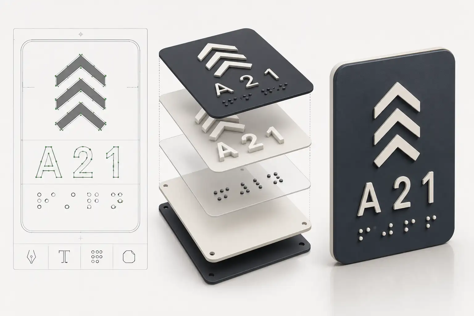
ADA interior signage is unforgiving: the tactile copy, the braille, and the finish all have to meet specific figures, and a file that gets any of them wrong scraps the sign. This is what the vector art has to carry so your fabrication meets the 2010 ADA Standards — set up layer by layer.
Tactile copy, Grade 2 braille, and rout layers — built to the standard.
Outlined fonts, braille as vector geometry, and separate named layers your router reads directly. Production-correct in 24 hours.
Need something custom? Email hello@vectorwiz.com
Tactile characters and braille, at a glance
| Element | Requirement | In the vector file |
|---|---|---|
| Raised character height | 5/8" to 2" (uppercase I) | Set at final size; fonts outlined to paths |
| Raised height above surface | min 1/32" | Tactile copy on its own named appliqué/rout layer |
| Character style | Sans-serif, uppercase, non-italic, non-decorative | Approved font, converted to outlines |
| Braille | Contracted Grade 2, domed dots | Vector dots on a named braille layer, not a font |
| Braille position | min 3/8" below the text, clear of other copy | Placed as geometry at correct offset |
| Pictograms | field min 6" high, text below the field | Pictogram + separate tactile text below |
| Contrast | 70% between characters/symbols and background | Color-separated layers named to the finish |
1. Tactile copy on its own layer
Raised (tactile) text must be sans-serif, uppercase, non-italic, and non-decorative, with character heights measured on the uppercase letter I between 5/8 inch and 2 inches. In the file, that copy sits on a dedicated named layer as clean closed paths with the font fully outlined — never a live font — so the fabricator's router or laser reproduces the exact character shapes for the raised layer.
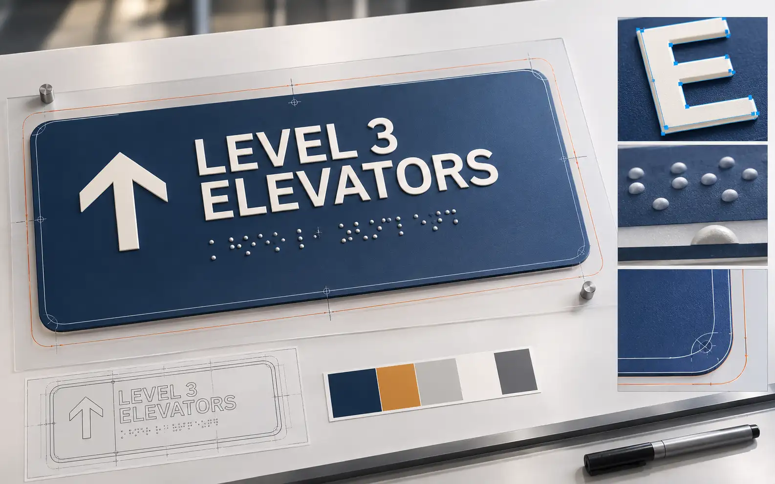
2. Grade 2 braille as geometry, not a font
ADA braille is contracted (Grade 2) with domed or rounded dots at standardized spacing, placed at least 3/8 inch below the tactile text and separated from other elements. The braille has to be real vector geometry on its own layer — dots the fabricator raises or routs — not a braille typeface that could be flattened or mis-spaced. We build the braille as placed vector dots so the dot base diameter and spacing stay correct through fabrication.
3. Pictograms in a compliant field
Where a pictogram is required, its field must be at least 6 inches high, and any tactile text describing it goes below the pictogram field — not overlapping it. In the file, the pictogram and its descriptive tactile text are separate elements on the right layers so the fabricator can place and raise each correctly.
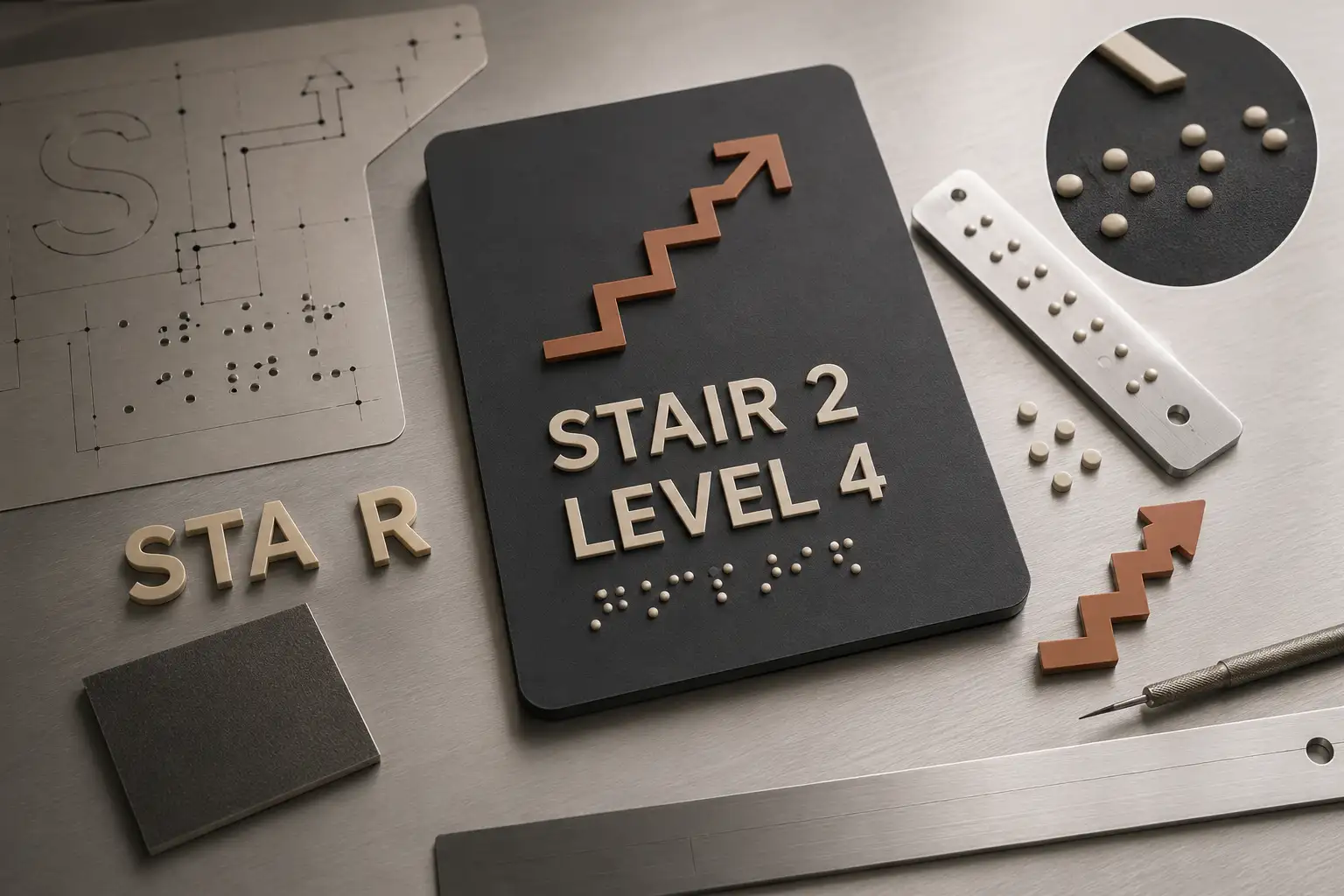
4. Contrast and finish live in the layers
ADA requires non-glare character, symbol, and background finishes and at least 70% contrast between the characters or symbols and their background. Finish is a fabrication choice, but the file makes it buildable: colors are separated onto named layers that map to the substrate, appliqué, and copy finishes, so nothing is guessed at the router.
How the layers should arrive
- Tactile copy layer — outlined sans-serif uppercase paths at final raised-character size.
- Braille layer — contracted Grade 2 dots as vector geometry at correct spacing and offset.
- Pictogram layer — symbol in a compliant field, with descriptive text separated below.
- Rout / appliqué paths — closed paths per layer so the router or laser cuts each cleanly.
- Color separation named to the finish, so contrast and substrate are unambiguous.
It is manual vector file prep for ADA fabrication — not a compliance certification. We build the art to the standard's figures so your shop fabricates to spec; final sign-off stays with the fabricator and the authority having jurisdiction.
Frequently asked questions
What does ADA-compliant sign artwork require?
Under the 2010 ADA Standards, tactile signs need raised characters (min 1/32" high), sans-serif uppercase text between 5/8" and 2" tall, contracted Grade 2 braille below the text, non-glare finishes, and 70% contrast between characters and background. The vector file has to keep those elements on separate, correctly built layers.
How should braille be set up in the vector file?
As contracted Grade 2 braille on its own named layer, with domed/rounded dots at the standard spacing, positioned at least 3/8" below the tactile text and clear of other elements. It is placed as vector geometry the fabricator routs or raises — not typed as a braille font that a raster would flatten.
What fonts are allowed on ADA tactile signs?
Sans-serif, non-italic, non-decorative fonts, set in uppercase for the tactile copy, with character proportions and stroke widths within the ADA range. Fonts must be outlined to paths in the vector file so the fabricator's router or laser reproduces the exact shapes.
Does VectorWiz certify my sign is ADA-compliant?
No. We prepare the vector art — layered, outlined, with tactile copy and Grade 2 braille built to the 2010 ADA Standards figures — so your fabrication can meet spec. Final compliance depends on fabrication, finish, mounting height, and the authority having jurisdiction, which the fabricator and installer confirm.
Can you build the rout and appliqué paths for tactile layers?
Yes. Raised copy, braille, and pictograms come on separate named layers with clean closed paths so your router or laser cuts the tactile and appliqué layers directly. Send the sign spec and we set the file up for that workflow.
Naimur Rahman
Leads design direction and quality at VectorWiz. Reviews and redraws production artwork by hand across sign, wrap, screen-print, and CNC work.
Related articles
Drawn by hand. Built for production.
Instant pricing, no commitment. Production-correct vectors in your inbox in 24.